|
|
This is my final logo. It meets the 5 requirements for a good logo design. My final logo is simple because it is just a couple of letters with a lighting streak and a shoe. It can not get more simpler than that. My final logo is unique because no other logo looks like this. It has its own personal shoe and no logo has a lightening streak with a shoe with it. My final logo is timeless because it could look and be the same for forever. My final logo is versatile because even in Black and White it still looks the same and means the same thing. Even if it is small it still is the SAME exact logo. My final logo speaks to the audience by trying to look friendly and look good. My final logo wants to appeal to the audience so they buy the product. It wants to have a positive affect on the audience.
|
|
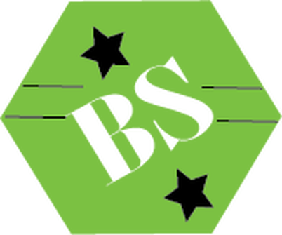
This is my final logo design.My final logo design meets the 5 requirements of a good logo design by:
My final logo is SIMPLE because it just has simple, easy shapes. My final logo doesn’t have too much detail on it. It’s simple because it just has two letters, two shapes, four lines, and it is green, black, and the initials are white. my final logo is really simple and easy going. My final logo is TIMELESS because you could keep the same exact logo for a very long time.This logo could be used for a bunch of things for a long amount of time. This logo is ageless and it has no expiration date on it, so any company could use this logo for how ever long they want. My final logo design is MEMORABLE because it’s easy to remember. All you got to remember is a green hexagon, a couple of stars and lines, and two letters. This logo design is really easy to remember. Look at it once for a couple of seconds and it will be stuck in your mind. My final logo is APPROPRIATE because it has nothing bad or inappropriate. Even little kids can see the logo. There is nothing bad or anything that symbolizes something bad. You know it’s app if little children are aloud to see this logo. There is nothing wrong, bad, or anything in-appropriate on this logo. My final logo is VERSATILE because even if it changes to black and white, big or small it’s still the same logo. Nothing really changes about the logo. It will still be the same logo, just with a different size or black or white, or even both. This logo is versatile. I chose this logo as my final logo because I love the color green and I like how it looks. I like the stars and how it looks cool and how it goes together so well. I love the way my initials look and how it goes with the hexagon. I love everything about my final logo. |
|
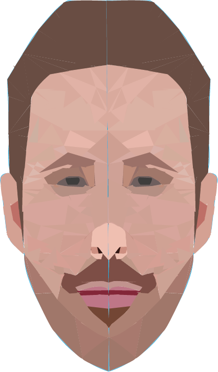
This is my vector portrait. I found a symmetrical picture of a celebrity and traced half of the face with the pen tool. Then i started to make triangles with the pen tool on the traced side of the face. It was different sizes and shapes of triangles. Then after I used the eye dropper tool to color the triangles different shades to make it look like my celebrity. After i grouped everything together and copied the traced side and reflected it and lined them both up. Then i grouped them together and it made this.
|
